( COLORS )
Good Colors
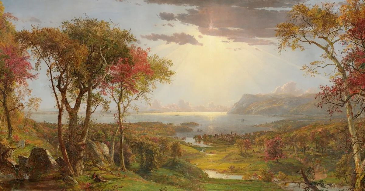
At the top of this page hangs an autumn painted from memory. In 1860, in his London studio, Jasper Francis Cropsey remembers the banks of the Hudson and lays on the canvas reds, golds and greens that the English public does not believe possible. A critic sees in it "not the solemn wasting away of the year, but its joyful crowning festival." What a magnificent phrase! The season is the same as anywhere else. The colors are what make it a festival.
A color is not picked at random. It is an art, with its masters and its studio secrets. The painter knows that a red sings or shouts depending on the green beside it. The printer knows that a screen blue fades the moment it touches paper. The researcher knows that one man in twelve will not tell two curves apart if one is red and the other green. Let us leave it to the professional.
That is what this page is for: handing the choice to those who made it their trade. Apple's designers for the screen, Masataka Okabe and Kei Ito for science, the rules of the printing house for paper. Three palettes, three trades and a single vocabulary: "red" exists in each one, but it is never the same red. A document written with these names changes use without a single color being touched. Click a swatch and its code is yours.
Pick a palette
Apple's system colors, for screens, presentations and digital products.
The Okabe-Ito palette, readable by people with color blindness, for scientific figures.
Ink recipes for offset printing, in the manner of art books.
The swatches
Eight hues, each with a light version for backgrounds, then four neutrals. A click copies the hex code. The text on each swatch takes whichever ink reads best, black or white.
The neutrals
The three palettes side by side
Same name, three values. The print palette adds its ink recipe: cyan, magenta, yellow and black, in percent.
| Color | Corporate | Academic | |
|---|---|---|---|
| Red | #FF383C | #D55E00 | #E42113 0 95 100 0 |
| Orange | #FF8D28 | #E69F00 | #EF7D00 0 60 100 0 |
| Yellow | #FFCC00 | #F0E442 | #FFDA00 0 12 100 0 |
| Green | #34C759 | #009E73 | #00983A 90 0 100 5 |
| Turquoise | #00C3D0 | #56B4E9 | #00A79E 85 0 45 0 |
| Blue | #0088FF | #0072B2 | #004A94 100 70 0 10 |
| Purple | #CB30E0 | #CC79A7 | #78368C 65 90 0 0 |
| Pink | #FF2D55 | #CC79A7 | #E94287 0 85 10 0 |
| Brown | #AC7F5E | #AC7F5E | #8C5930 30 60 80 35 |
| Black | #000000 | #000000 | #030A0A 60 40 40 100 |
| Gray | #8E8E93 | #8E8E93 | #939292 0 0 0 55 |
| White | #FFFFFF | #FFFFFF | #FFFFFF 0 0 0 0 |
Where the three palettes come from
Corporate
The corporate palette takes the system colors of Apple's Human Interface Guidelines, the design guide for its software. Apple revised them on June 9, 2025, along with its new interface style. The values on this page are the light-mode values published that day. Turquoise is Apple's teal; brown and gray are those of its system.
Why start from Apple? These colors are tuned for the screen by the teams who design the software of the iPhone and the Mac. They are bright without being garish and each one keeps a readable text on top of it. It is the default palette for a presentation, a dashboard or a website.
Academic
About one man in twelve has trouble telling red from green. In 2002, Masataka Okabe and Kei Ito published eight colors that stay distinct for most of these people. The journal Nature Methods recommended them in 2011 and they became the norm for scientific figures.
The Okabe-Ito palette has seven hues plus black. Pink and purple therefore share the same value, its reddish purple: inventing an eighth hue would have lost the guarantee. Turquoise becomes its sky blue. Brown, gray and white, absent from the original palette, come from the corporate palette.
A screen color is not a print color. A screen adds light; a press lays four inks on paper (cyan, magenta, yellow and black) and cannot reproduce everything a screen shows. A bright screen blue comes out purplish, a vivid green comes out olive. This palette therefore starts from the inks: each color is a CMYK recipe, the share of each ink in percent. Its screen code is only a preview.
It draws on the art books of Taschen, made of flat, solid colors on coated paper. Taschen publishes no brand palette: this one is not theirs. It borrows their method. Each bright hue uses two inks at most, which every press can hold. Total ink coverage stays under 300%, the limit for coated paper. Solid black areas use a rich black, 60% cyan, 40% magenta, 40% yellow and 100% black; text is set in black alone. The previews were computed with the FOGRA39 print profile, the European standard for offset on coated paper.
What colors suggest
The tables below gather common associations in Western culture. They are conventions, not laws: white for mourning in East Asia or green in Islam are reminders that a color is always read in context. The dots follow the palette you picked.
One color per emotion
One color per idea
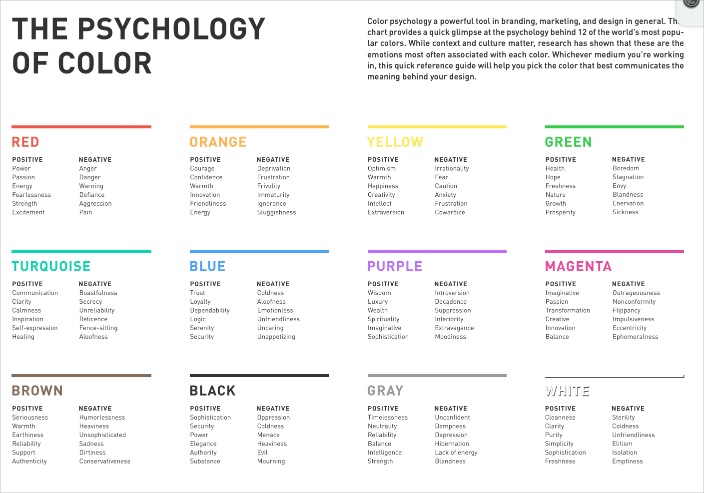
The psychology of colors
| Color | Positive associations | Negative associations |
|---|---|---|
| Red | Power, Passion, Energy, Fearlessness, Strength, Excitement | Anger, Danger, Warning, Defiance, Aggression, Pain |
| Orange | Courage, Confidence, Warmth, Innovation, Friendliness, Energy | Deprivation, Frustration, Frivolity, Immaturity, Ignorance, Sluggishness |
| Yellow | Optimism, Warmth, Happiness, Creativity, Intellect, Extraversion | Irrationality, Fear, Caution, Anxiety, Frustration, Cowardice |
| Green | Health, Hope, Freshness, Nature, Growth, Prosperity | Boredom, Stagnation, Envy, Blandness, Enervation, Sickness |
| Turquoise | Communication, Clarity, Calmness, Inspiration, Self-expression, Healing | Boastfulness, Secrecy, Unreliability, Reticence, Fence-sitting, Aloofness |
| Blue | Trust, Loyalty, Dependability, Logic, Serenity, Security | Coldness, Aloofness, Emotionless, Unfriendliness, Uncaring, Unappetizing |
| Purple | Wisdom, Luxury, Wealth, Spirituality, Imaginative, Sophistication, Introversion | Decadence, Suppression, Inferiority, Extravagance, Moodiness |
| Pink | Imaginative, Passion, Transformation, Creative, Innovation, Balance | Outrageousness, Nonconformity, Flippancy, Impulsiveness, Eccentricity, Ephemerality |
| Brown | Seriousness, Warmth, Earthiness, Reliability, Support, Authenticity | Humorlessness, Heaviness, Unsophisticated, Sadness, Dirtiness, Conservativeness |
| Black | Sophistication, Security, Power, Elegance, Authority, Substance | Oppression, Coldness, Menace, Heaviness, Evil, Mourning |
| Gray | Timelessness, Neutrality, Reliability, Balance, Intelligence, Strength | Unconfident, Dampness, Depression, Hibernation, Lack of energy, Blandness |
| White | Cleanliness, Clarity, Purity, Simplicity, Sophistication, Freshness | Sterility, Coldness, Unfriendliness, Elitism, Isolation, Emptiness |
Using them well
A chart reads its colors in the order of the swatches: the first series takes red, the second orange and so on. Beyond five or six series the eye stops following; group the series or split the chart.
A color should never be the only sign of a piece of information. Add a label, a shape or a pattern: a dotted line still stands out in black and white, on a screen in the sun, on a photocopy.
Text needs contrast. The Web accessibility standard (WCAG) requires a ratio of 4.5 between body text and its background. Light tints serve as backgrounds, solid hues as signals. For colored text on white, check the ratio: yellow never passes.
For print, ask the printer for its profile and ink limit before sending files: they override any recipe. Have a proof pulled on the real paper, above all for light tints, which fade on uncoated paper.
Download
Each palette comes as a CSV file, readable by a spreadsheet or a program: English name, French name, hex code, red, green, blue and light tint. The print file adds the CMYK recipes.
- Corporate palette-corporate.csv
- Academic palette-academic.csv
- Print palette-print.csv
- What colors suggest meanings.csv
The version for AI agents
This page has a sibling for coding agents. The sprezzature-colors brick does the same work on request: it checks the contrast of every color pair, simulates how a person with color blindness sees a picture and fixes a hue that is too pale while keeping its name.
It is part of sprezzature, an open-source toolbox for Claude Code and OpenCode that builds and checks interfaces, figures and web pages from a plain-language request. The palette on this page is where it started.
Resources
 Coolors
A very fast palette generator.
 A Dictionary of Color Combinations
The color combinations of Sanzo Wada (1883-1967).
 Tints and Shades
To derive the light and dark versions of a color.
 Adobe Color
Palettes and trends from the Adobe community.
 Okabe and Ito (2002)
The original note that defines the academic palette.
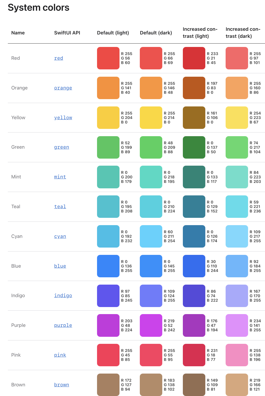 Apple, Human Interface Guidelines
The system colors of the corporate palette.
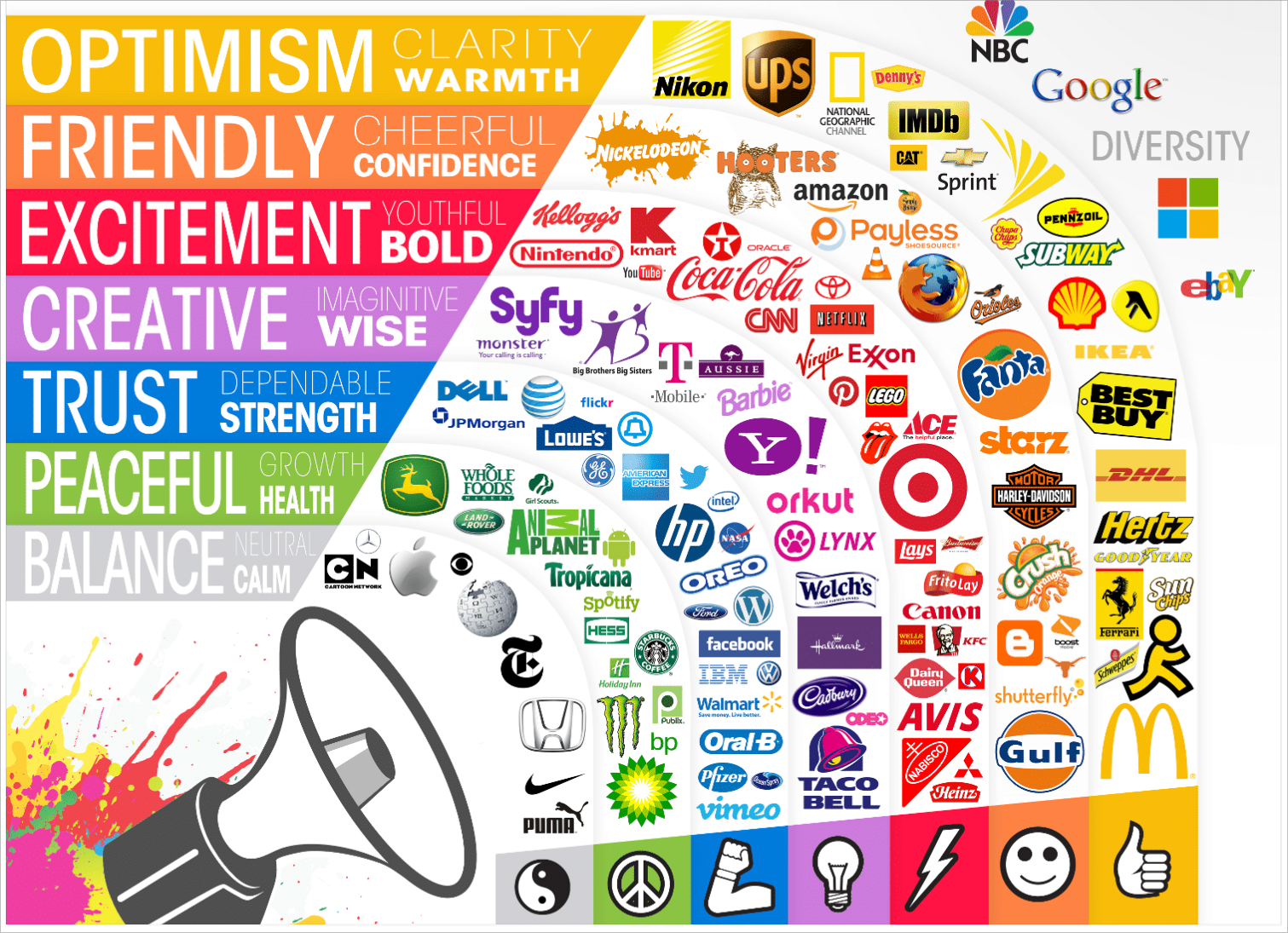
Two guides to get started
No idea where to begin? Start from one of these two combination sheets. A click enlarges them.
Thanks to Audrey Dejoux, Laurent Pantanacce and Jérôme Gombert for our discussions. Laurent Pantanacce is a coauthor of the original palette. The page also owes much to Apple's guides and to Google's Material Design.
Frequently asked questions
Which color palette should I use for a scientific chart?
The academic palette, by Masataka Okabe and Kei Ito (2002). Its colors stay distinct for most people with color blindness, about one man in twelve. The journal Nature Methods has recommended it since 2011.
What are the codes of Apple's system colors?
In light mode, since the update of June 9, 2025: red #FF383C, orange #FF8D28, yellow #FFCC00, green #34C759, turquoise (teal) #00C3D0, blue #0088FF, purple #CB30E0, pink #FF2D55. These are the values of the corporate palette on this page.
Why do screen colors look dull in print?
A press mixes four inks, cyan, magenta, yellow and black, which cannot reproduce every screen color. Bright blues turn purple, vivid greens turn olive. The print palette on this page starts directly from the inks, two at most for each bright hue.
What is a rich black?
A black printed with all four inks, here 60% cyan, 40% magenta, 40% yellow and 100% black. It gives deeper solid areas than black alone. Text, though, is set in black alone, which does not suffer when the plates drift slightly out of register.
Can I use these palettes freely?
Yes. The codes are there to be copied and each palette downloads as a CSV file. The open-source sprezzature-colors brick applies them and checks their contrast automatically.