Open source
From a Table to a Map
Standpoint reads a comparison table and draws a positioning map, named axes included. One command does it.
 Open Standpoint in the browser ↗
Everyone has seen this kind of table before. Options as rows, criteria as columns, ratings in the cells. This one compares twelve programming languages on seven criteria, each rated from one to five stars.
| Programming Language | Performance | Ease of Learning | Ecosystem | Concurrency | Type Safety | Job Market | Tooling |
|---|---|---|---|---|---|---|---|
| Python | ⭐️⭐️⭐️⭐️⭐️ | ⭐️⭐️⭐️⭐️⭐️ | ⭐️⭐️⭐️⭐️⭐️ | ⭐️⭐️⭐️⭐️⭐️ | ⭐️⭐️⭐️⭐️⭐️ | ⭐️⭐️⭐️⭐️⭐️ | ⭐️⭐️⭐️⭐️⭐️ |
| Rust | ⭐️⭐️⭐️⭐️⭐️ | ⭐️⭐️⭐️⭐️⭐️ | ⭐️⭐️⭐️⭐️⭐️ | ⭐️⭐️⭐️⭐️⭐️ | ⭐️⭐️⭐️⭐️⭐️ | ⭐️⭐️⭐️⭐️⭐️ | ⭐️⭐️⭐️⭐️⭐️ |
| Go | ⭐️⭐️⭐️⭐️⭐️ | ⭐️⭐️⭐️⭐️⭐️ | ⭐️⭐️⭐️⭐️⭐️ | ⭐️⭐️⭐️⭐️⭐️ | ⭐️⭐️⭐️⭐️⭐️ | ⭐️⭐️⭐️⭐️⭐️ | ⭐️⭐️⭐️⭐️⭐️ |
| JavaScript | ⭐️⭐️⭐️⭐️⭐️ | ⭐️⭐️⭐️⭐️⭐️ | ⭐️⭐️⭐️⭐️⭐️ | ⭐️⭐️⭐️⭐️⭐️ | ⭐️⭐️⭐️⭐️⭐️ | ⭐️⭐️⭐️⭐️⭐️ | ⭐️⭐️⭐️⭐️⭐️ |
| TypeScript | ⭐️⭐️⭐️⭐️⭐️ | ⭐️⭐️⭐️⭐️⭐️ | ⭐️⭐️⭐️⭐️⭐️ | ⭐️⭐️⭐️⭐️⭐️ | ⭐️⭐️⭐️⭐️⭐️ | ⭐️⭐️⭐️⭐️⭐️ | ⭐️⭐️⭐️⭐️⭐️ |
| Java | ⭐️⭐️⭐️⭐️⭐️ | ⭐️⭐️⭐️⭐️⭐️ | ⭐️⭐️⭐️⭐️⭐️ | ⭐️⭐️⭐️⭐️⭐️ | ⭐️⭐️⭐️⭐️⭐️ | ⭐️⭐️⭐️⭐️⭐️ | ⭐️⭐️⭐️⭐️⭐️ |
| C++ | ⭐️⭐️⭐️⭐️⭐️ | ⭐️⭐️⭐️⭐️⭐️ | ⭐️⭐️⭐️⭐️⭐️ | ⭐️⭐️⭐️⭐️⭐️ | ⭐️⭐️⭐️⭐️⭐️ | ⭐️⭐️⭐️⭐️⭐️ | ⭐️⭐️⭐️⭐️⭐️ |
| C# | ⭐️⭐️⭐️⭐️⭐️ | ⭐️⭐️⭐️⭐️⭐️ | ⭐️⭐️⭐️⭐️⭐️ | ⭐️⭐️⭐️⭐️⭐️ | ⭐️⭐️⭐️⭐️⭐️ | ⭐️⭐️⭐️⭐️⭐️ | ⭐️⭐️⭐️⭐️⭐️ |
| Ruby | ⭐️⭐️⭐️⭐️⭐️ | ⭐️⭐️⭐️⭐️⭐️ | ⭐️⭐️⭐️⭐️⭐️ | ⭐️⭐️⭐️⭐️⭐️ | ⭐️⭐️⭐️⭐️⭐️ | ⭐️⭐️⭐️⭐️⭐️ | ⭐️⭐️⭐️⭐️⭐️ |
| Kotlin | ⭐️⭐️⭐️⭐️⭐️ | ⭐️⭐️⭐️⭐️⭐️ | ⭐️⭐️⭐️⭐️⭐️ | ⭐️⭐️⭐️⭐️⭐️ | ⭐️⭐️⭐️⭐️⭐️ | ⭐️⭐️⭐️⭐️⭐️ | ⭐️⭐️⭐️⭐️⭐️ |
| Swift | ⭐️⭐️⭐️⭐️⭐️ | ⭐️⭐️⭐️⭐️⭐️ | ⭐️⭐️⭐️⭐️⭐️ | ⭐️⭐️⭐️⭐️⭐️ | ⭐️⭐️⭐️⭐️⭐️ | ⭐️⭐️⭐️⭐️⭐️ | ⭐️⭐️⭐️⭐️⭐️ |
| Elixir | ⭐️⭐️⭐️⭐️⭐️ | ⭐️⭐️⭐️⭐️⭐️ | ⭐️⭐️⭐️⭐️⭐️ | ⭐️⭐️⭐️⭐️⭐️ | ⭐️⭐️⭐️⭐️⭐️ | ⭐️⭐️⭐️⭐️⭐️ | ⭐️⭐️⭐️⭐️⭐️ |
The input table, as you would fill it in: twelve options, seven criteria, one rating per cell. This is exactly the file Standpoint reads.
The table is honest, complete, verifiable. It is also unreadable, as you have just experienced: eighty-four cells of stars to compare in your head, seven columns to weigh against one another; the eye gives up. The choice falls back on gut feeling, the very thing the table was meant to prevent. Worse, two sincere readings of the same table crown two different winners, without either being dishonest.
Standpoint turns that table into a map. Each option becomes a point on a plane; two nearby points are two similar profiles; the ends of the axes carry plain words, in the language of your columns. The question the map answers fits on one line: where do you stand?
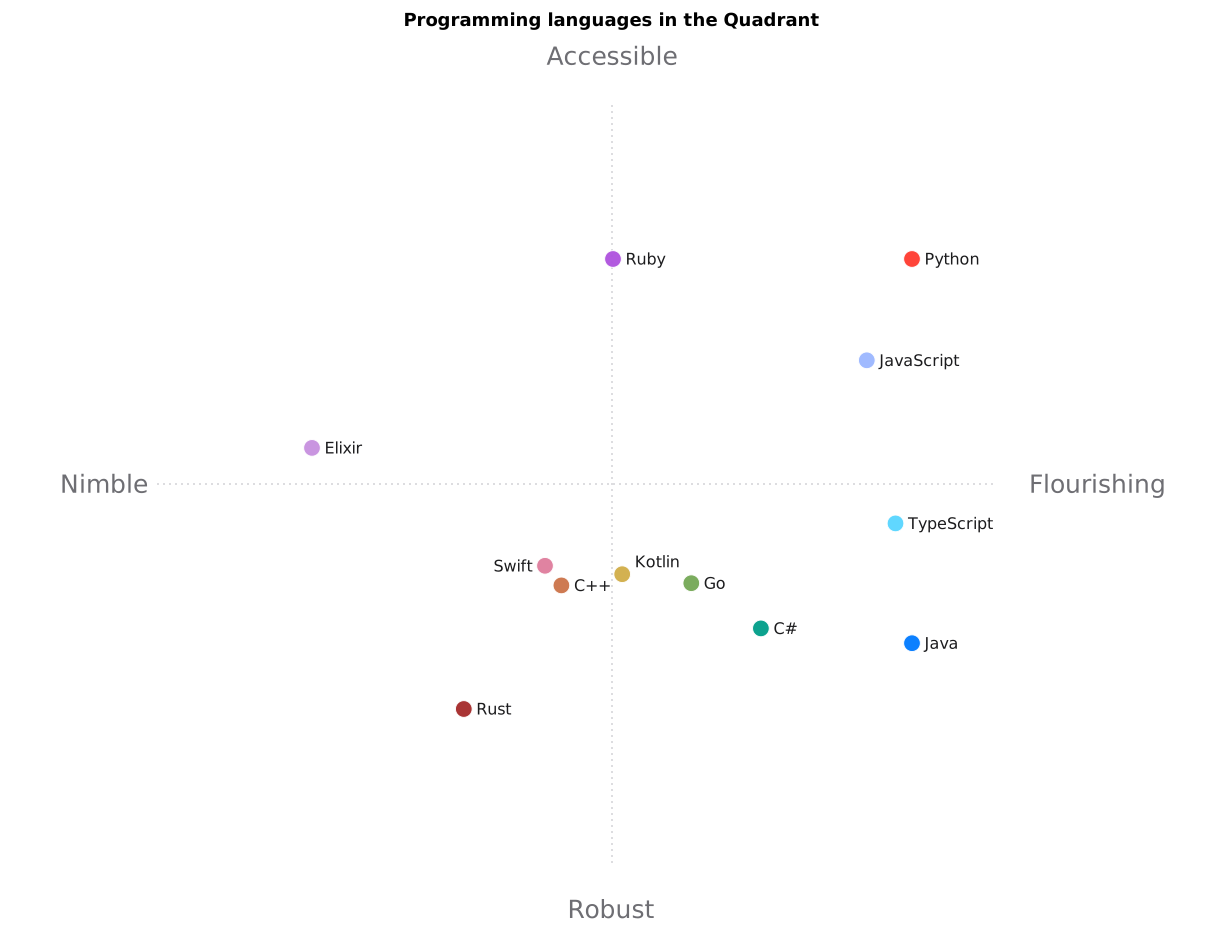
The same table, seen from above: the twelve languages placed relative to one another, the leader at the top right, challengers along each axis.
What it is for
The question that calls for a map is recognisable by its shape. Several options, several criteria, and the obligation to say where each one stands against the rest. Settling on a cloud provider for the next three years. Choosing the language a team will write in for the next five. Placing your product against six competitors before a board meeting. Cutting fifteen applications down to a shortlist, and being able to say why those ones.
The repository tracks four demonstration tables, which give the measure of what the tool swallows. Cloud providers. Laptops, where price and weight are declared as columns where less is better. French electric cars, whose table comes back with a French title and French axis names. And the programming languages from the introduction. Nothing connects these subjects except the shape of the file, names in the first column and numbers everywhere else.
It is worth saying what a tool cannot do, before it disappoints. One variable to plot, or two, needs no map, and an ordinary chart serves better. PCA used as dimensionality reduction inside a learning pipeline belongs to scikit-learn, since what happens there is a computing step rather than a figure to show. A ranking on a single criterion is settled by sorting one column. And Standpoint maps a table that already exists: it fetches no data, checks no rating and holds no opinion on how honestly you filled it in.
Motivation
Positioning maps are a staple of marketing and consulting: people sketch them on whiteboards to place brands, products, competitors. The method that builds them properly, Principal Component Analysis (PCA), is more than a century old: Karl Pearson laid out its geometry in 1901, Harold Hotelling formalised it in 1933. Its idea can be understood on a school report card: eight subjects per student, yet two summaries often suffice to place everyone, a science leaning and a humanities leaning. Given many columns of numbers, PCA does the same: it finds the few directions along which the options differ the most, so a whole row of ratings collapses into two numbers that still carry most of what distinguishes it from the rest.
That a method from 1901 is still the right one in 2026 deserves a line, in an age whose reflex is to throw a large model at everything. Twelve rows and seven columns is a tiny problem. PCA settles it in milliseconds, with no training, no one else's data, and a result you can redo by hand on the back of an envelope if you care to check. The century's head start was never caught up because there was nothing to catch: for projecting a small table of numbers, the right answer was already there.
The method is well known; what costs time is everything around it. Orienting the map so it reads the right way. Naming the axes with words a management committee understands. Coloring, labeling without overlaps, exporting at print quality. That workshop labor is what Standpoint automates. One command reads the table, in CSV or Markdown, two common ways of writing a table in plain text. It writes the figure, as SVG and PNG. It writes a YAML file too, readable as-is, holding every coordinate and every coefficient.
The existing tooling splits into two
families that face away from each other. On one side, the statistical toolkits. In Python, prince or the PCA in scikit-learn, the standard machine-learning kit;
in R, the statisticians' language, FactoMineR and factoextra. They are impeccable on the computation, reproducible,
scriptable. But what they hand you is components, the raw axes of the computation and numbers. Naming
the axes, orienting the map, making it presentable is left to you.
On the other side the layout tools, a four-box slide, a Canva template, up to the famous magic quadrant
of the analyst firm Gartner: the result is shareable immediately, but every dot is placed by hand.
Nothing is derived from the data, nothing is reproducible; the axes mean whatever the author decided
they mean.
The quadrant everybody looks at
One member of that second family is worth a stop, since no positioning map on earth is looked at more. Gartner is an American firm whose business is analysing software markets on behalf of the companies that buy. Every year, for dozens of markets, it publishes a figure called the Magic Quadrant, which comes down to two axes and four boxes. Along the bottom, completeness of vision: what the vendor has understood about the market and where it is going. Up the side, ability to execute: what it can actually ship today. The four corners carry names that have entered ordinary speech: Leaders top right; Challengers top left, who execute without the wider view; Visionaries bottom right, who see correctly and cannot yet deliver; Niche Players bottom left.
It is worth weighing what that box carries. Appearing in it is an achievement in itself: Gartner only places vendors it judges significant enough to cover, and many companies work for years to clear that bar. Once inside, the box moves budgets. A CIO defending a seven-figure purchase to a board finds in it a warrant anyone can read at a glance, and some tenders are written by copying it out.
That weight is what makes the question of its manufacture interesting, and Gartner has had occasion to settle it in court. In 2009 the Californian vendor ZL Technologies sued for defamation, holding that its place in the box was costing it customers. Gartner's defence was that the quadrant is protected opinion rather than an assertion of fact. The federal court for the Northern District of California agreed in 2010; the decision was upheld on appeal.
There is nothing dishonourable in that, quite the opposite. An expert opinion owned as one beats an invented measurement. Gartner's rests on a year of interviews, vendor briefings and calls to their customers that no computation replaces. It merely names precisely what you are looking at: a point's position there is a judgement, and a judgement cannot be replayed.
Standpoint does not aim at that expertise and does not replace it. It promises something far narrower, and checkable: a point's position comes out of a table you can read, by a computation you can run again. A point that surprises you traces back to its row and its ratings. The price falls on the same side and should be said: a derived map is worth no more than the ratings in the table. Filling in eighty-four cells by instinct and then projecting them cleanly manufactures no knowledge; it makes what you put in visible and arguable, which is a great deal, and is not the same thing as knowing.
Standpoint aims for the corner nobody occupies: the derived map of a statistical toolkit with the finished artifact of a layout tool. It innovates on one specific point: having a language model, the kind of program that handles text the way ChatGPT does, read the components and turn them into axis names in plain words. PCA applied to positioning maps is a classic; handing the naming of the axes to a machine is much less so.
Then there is the scope, which decides whether a tool gets used at all. The package installs from PyPI, the public repository of Python packages. The tests replay automatically on every change to the code, which is what continuous integration means. Four example sets are versioned along with their figures. The documentation exists in English and in French. The same engine comes in seven forms, detailed below. Standpoint is built to be used by someone other than its author.
One architectural choice matters to me: everything runs on your machine. The computation, the drawing and even the axis naming, handled by a local language model running under Ollama, a program that runs open models on your own computer. Your table, which sometimes holds internal notes about your competitors, is never uploaded anywhere.
How it works
Before any arithmetic, one quiet decision is worth knowing, because it protects you. A cell left blank is not ignored: it takes the smallest value observed in its column. A missing rating can therefore never flatter an option, which shuts the door on the table where one conveniently forgets to rate oneself on the awkward criterion.
First step: put the criteria on an equal footing. A 5-point comfort rating and a price in thousands of euros cannot be compared as they are; without care, the column with the biggest numbers would crush all the others. Each column \(j\) is therefore centered on its mean \(\mu_j\) and scaled by its standard deviation \(\sigma_j\), which measures how far the column's values typically stray from that mean:
After this rescaling, every criterion weighs the same: a difference of one means "one standard deviation above average" everywhere.
Second step, the mathematical core. Picture the options as a cloud of points in a seven-dimensional space, one dimension per criterion. Nobody can picture seven dimensions, but the cloud image is all you need: each language is a point, placed by its ratings. PCA looks for the plane that, viewed head-on, spreads that cloud out as much as possible: the two directions \(v_1, v_2\) along which the options pull apart the most. In technical terms, they are the top two eigenvectors of the covariance matrix of the rescaled data (the table that says which criteria vary together), the ones tied to the largest eigenvalues \(\lambda_1 \ge \lambda_2\); in plain terms, the two directions the computation singles out as richest in differences. An option's position on the map is then its projection, its shadow cast onto that plane:
The angle brackets \(\langle\cdot,\cdot\rangle\) denote the scalar product, the operation that measures how far a point advances along a direction. A flat map remains a summary of a richer space. The share of information it keeps can be measured; Standpoint prints it on the figure:
Around 80%, the map tells the table's story faithfully; below that, read it as a sketch.
Third step, orientation. A raw PCA map comes out facing an arbitrary way: nothing forces the "good" corner to sit at the top right. Standpoint rotates the plane to put your reference option there, the one whose position you want to tell. One edge case is handled: a reference rated top marks on everything would land far away from everyone; it is placed just past the best competitor instead, where the map stays legible.
Then comes what the map singles out; here too, nothing is decided by hand. Four options get separate treatment, each picked by geometry alone. The leader is the reference, top right by construction. The weakest is the point whose projection onto the diagonal running up to that corner is the smallest, which is to say the one losing on both axes at once. That leaves two challengers: the one reaching highest up the vertical axis, the one reaching furthest along the horizontal, once the leader is set aside. Those two earn a look because each embodies a pole better than anyone else without winning outright.
Colour follows the same rule. Every competitor takes its hue from the direction it sits in as seen from the centre of the map, the hues being spread evenly around the colour wheel. Two neighbours on the map therefore carry neighbouring colours, which reads without thinking about it; the legend itself is ordered the way the map is, from the top-right corner downwards.
Last step, the words. PCA axes remain weighted sums of your columns, so they stay readable: one axis may lean on performance and concurrency, the other on ease of learning and job market. A local model reads those weights and names the four poles as positive qualities, in the table's language (English, French or Spanish, detected from the column names). A column where lower is better, marked "(↓)" as in Price (↓), yields a pole that names the benefit, "Affordable", never the drawback. A guard filters out acronyms, negations and antonym pairs before they ever reach an axis label.
A word on what that model is, since the term covers wildly different objects. A language model is a program trained to continue text; ChatGPT is one, a very large one. Its size is counted in parameters, the internal dials learned during training: the biggest line up hundreds of billions of them and run only in data centres. Distillation is the operation that carries a large model's know-how over to a small one, by having the second learn to imitate the first's answers on one task.
The one used here is deliberately tiny: a Qwen3 of 0.6 billion parameters, distilled for three narrow tasks. The first names the poles. The second agrees the words, singular and plural, so the labels land properly in both languages. The third proposes a rating from one to five where a cell is blank, and that is how this model reaches the position of the points: the values it proposes enter the PCA like any other, so they move the point on the quadrant. They are there to be corrected, which is the way to use them; on this project's own measurements they agree with the large model to within about three quarters of a rating step, on a subjective scale that holds five.
The model's size is the point. Everything computable is computed by the PCA, and the model steps in only where there is nothing to compute: putting a word on a combination of columns that already have names, or venturing a number where a cell was left blank. It never sees the ratings you typed, only weights, column headings and, for the filling, the row names. Work like that calls for no frontier model; it calls for one that fits on a laptop and does not leave the room.
One training result is worth reporting, because it runs against intuition. Two models had first been distilled, one per language. A third, trained on both languages at once, was added to measure what specialising had bought. It won everywhere: on naming the poles the two specialists topped out at 90%, where the bilingual one reaches 100% in each language. The reason lies in what a model this size struggles to produce, which is not the meaning but the exact shape of the answer, and that shape is the same from one language to the other. Training in two languages means seeing it twice as often. So one model ships, not two: better on every measurement and half as much to maintain.
The same standard led to removing a model rather than adding one. Standpoint can check its own figure and answer three questions: is the leader really at the top right, are the labels legible, is the legend visible? A vision model used to handle that, by looking at the rendered image. Counting its answers across the 1,480 examples recorded during distillation, two of the three questions came back "yes" 1,480 times, which is to say always; the third turns on the sign of a coordinate, which the program knows exactly. A model was being asked to squint at a picture for numbers already in hand. The check is now computed from the geometry, with no model, instantly and offline.
The best demonstration is to turn the tool on itself. The map below compares Standpoint to the other ways of drawing a positioning map, on seven criteria; it is produced by Standpoint from that very table. One caveat belongs here: Standpoint being the reference row, it ends up at the top right by construction; the ratings in the table are, besides, my own. Change the reference and the same map re-orients around another tool.
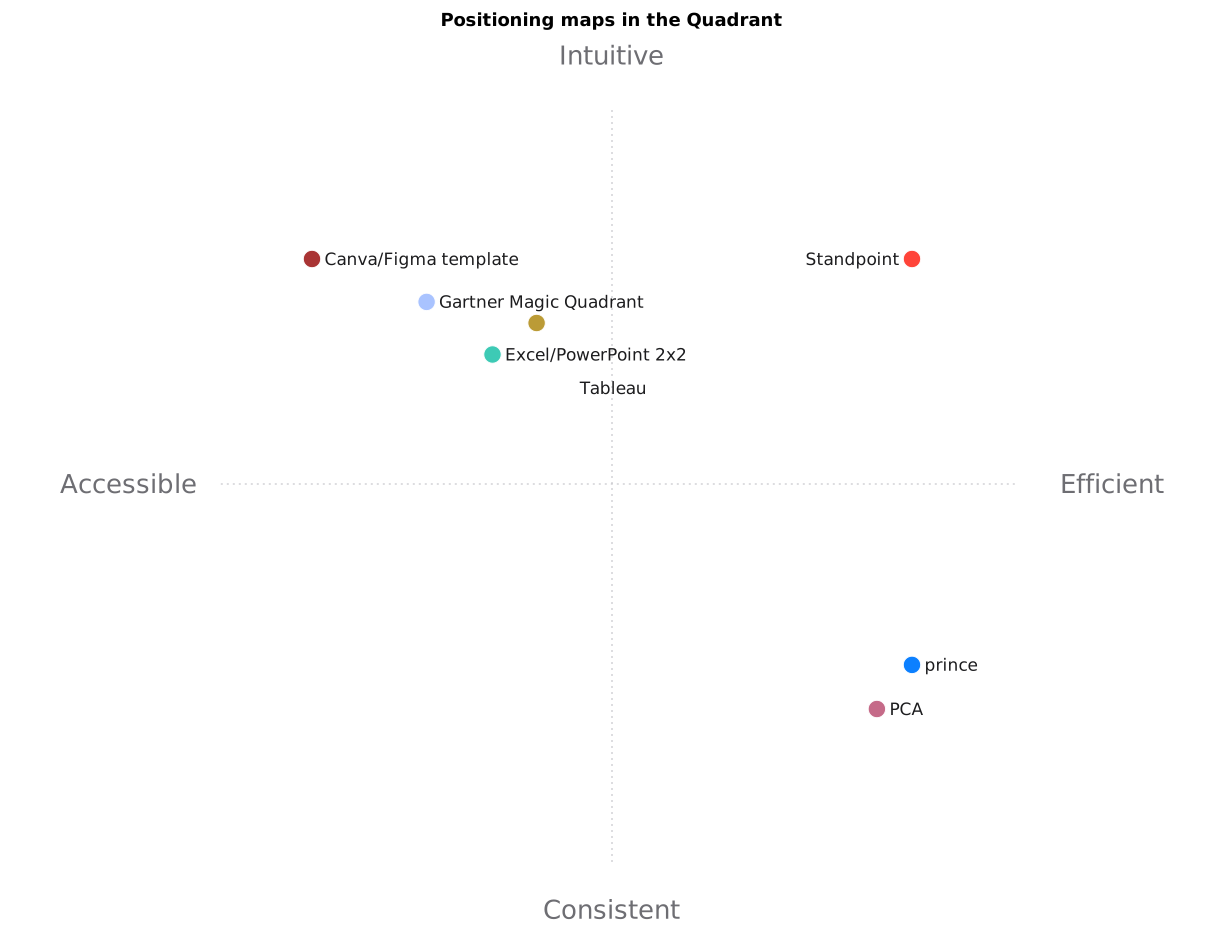
The tool judges itself: statistical toolkits on one side, layout tools on the other and the targeted corner where the two meet.
The same engine comes in seven forms: a
Python library (import standpoint), two twin command-line tools, a
browser GUI, an HTTP API (a doorway other programs can call over the network), a server for AI agents
(speaking the Model Context Protocol, MCP). The seventh is a fully static
build: the engine is compiled to WebAssembly, a format every browser knows how to execute, so it runs
at the visitor's end with no server at all. That last one is online at deraison.ai/standpoint: paste your table, get the map,
with nothing to install and no data leaving your machine. The two paths do not name the axes the same
way; it is fairer to say so. Installed on your machine, Standpoint goes through the small distilled
model described above. In the browser, the page carries a lighter model still, one that compares words
by meaning; it only loads a full language model if you ask it to fill the empty cells for you. The
figure itself is SVG composed by
hand, with no charting library: every stroke is a decision, not an inheritance from a template.
Not one of these pieces is impressive on its own. A linear projection Pearson did by hand in 1901. A pocket-sized model whose entire repertoire is its three small tasks. A drawing engine with no charting library. A table format anyone can type. A browser tab. The interest lies in the assembly: each piece hands the next exactly what it cannot do itself, the arithmetic to the algebra, the words to the model, the strokes to the SVG. Nothing, at the end, has been guessed.
From that modesty comes the property that changes how the thing is used. Because every piece is small, the whole fits in a tab, and your notes on your competitors stay with you: not by contractual promise, but for want of a server at the other end. Gartner puts a year of interviews and teams of analysts into placing a market. What you have here carries no such ambition, granted. It does, however, run inside the page you are reading, and it checks out row by row.
Conclusion
An honest table deserves better than a gut reading. The map does not replace the table: it gives the overview, the one that decides which rows to reread closely. And because the axes remain combinations of your own criteria, the map holds up in a meeting: every position traces back to the original figures, kept in the output YAML.
The fastest way to form an opinion is to try it: deraison.ai/standpoint runs the engine in your browser, with no install and no upload.
Standpoint is also open source under the BSD
license: pip install standpoint, then one command on your CSV. The
code, the examples and the documentation live at github.com/warith-harchaoui/standpoint. Bring a table; leave knowing where you
stand.